How to Add AppBar Class In Flutter
In general, the app bar is a highly used component in many applications. An app bar can be effectively helpful to house the search field, simply the page title or buttons to navigate around pages. It is a commonly used component, and Flutter app development services offer the dedicated widget for the functionality known as AppBar.
Flutter framework is the leading in market which is utilized to make the mobile app development ease for the developers with the single codebase.This guide will show you how to customize the AppBar in the Flutter app.
What is the AppBar Class in Flutter?
The Flutter AppBar is the app component that is built according to the guidelines of material UI design. Usually, it can be placed at the screen top and consist of other widgets around the layout effectively. The AppBar used to display branding information like titles and logos, and often it consists of buttons for user interaction.
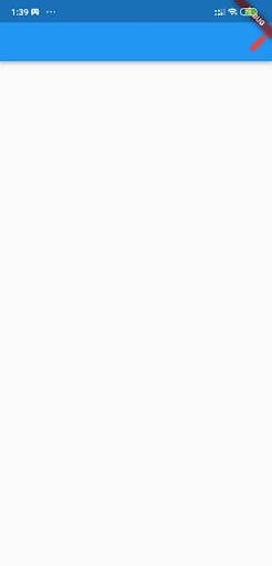
In this way, the default AppBar looks like in the Flutter:
Scaffold(
appBar: AppBar(),
),
Output

A blank page will appear and can be customized according to your liking.
AppBar layout:
The concept of Flutter layout of AppBar consists of three components: leading, actions and title. The leading will be placed at the AppBar’s left position, then the title and actions will appear on its right side.
1. Leading
The leading takes in the widget and can be assigned anything, such as an icon, text, or multiple widgets around the row.
AppBar(
leading: Icon(Icons.account_circle_rounded),
),
</pre>
Then you can control the total amount that the leading can take:
<pre class="EnlighterJSRAW" data-enlighter-language="generic">
AppBar(
leading: Icon(Icons.account_circle_rounded),
leadingWidth: 100, // default is 56
),
When the leading is not offered, AppBar can imply it automatically. Examples include the navigation arrow to get back into the menu icon or the previous page to open the drawer.
You can get the navigation arrow automatically when the previous route is readily available.
When the drawer is added to the scaffold widget, the menu icon can be assigned to the leading to open the drawer effectively.
Using the simple transfer protocol for sending messages through Flutter, functions are provided by the AppBar Class. For managing the images on a web page, functions are provided by AppBars. The keywords used for this AppBar are flip, resize, rotate, and watermarking. Next to the AppBar, third parties are used in the process.
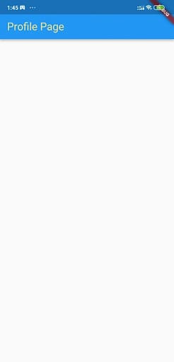
2. Title
It is useful for effectively showing titles such as the page header or app title.
AppBar(
title: const Text('Profile Page'),
)
Output

But you are not limited to it since the title will take the widget too. You can use it to show images, icons, shapes, or other combinations of layout widgets like rows and columns.
According to the material guidelines, the title can be aligned to the left of AppBar by default. You can also change it to align them to the center.
The AppBar is used to simplify the other method to do the third party helping with the advantages involved in the process. AppBar is the best third-party AppBar class used to streamline the process of databases, social networks, email, and multimedia. Apart from this process, specific issues like web security and the navigation process are used.
3. Actions
Actions are the list of widgets that can be aligned to AppBar’s right. You can check them out in apps that are used as buttons to trigger the profile avatars, dropdown menus, and much more.
It is also helpful for building large applications within the time framework. The Flutter format helps for accessible applications and for applying new settings for the applications without using the tools of local administration.
Generally, the information will be displayed based on the web pages through the search results provided by specific products and much more. The search results produced must be perfect, and it should present the result to the user with the links.
How to customize AppBar in Flutter?
Everyone is most aware of AppBar’s layout, and now you can take the customization to a different level by playing it with a wide range of theme options. The AppBar comprises many properties, such as sizes, colors, text themes, icon themes, and much more.
1. Background color
The below-mentioned code can be used to change the AppBar’s background color to deep orange. 500 are added to access the specific shade of the color. 50 is the lightest, and 900 is the darkest.
AppBar(
backgroundColor: Colors.deepOrange[500],
),
Output

2. Icon theme
The below-mentioned code can be used to change AppBar’s icon theme. It will change the size to 36 and the color to green.
AppBar(
        actionsIconTheme: IconThemeData(color: Colors.red, size: 36),
        actions: [Icon(Icons.edit)],
      ),
</pre>
Output
3. Title Text Style(Text theme is deprecated)
Here you have to change the color of the title text to amber with a lighter shade of 200 and then set the perfect font size to around 24.
AppBar(
        title: const Text("Profile Page"),
        titleTextStyle: TextStyle(
          // titleTextStyle is used for setting title's style
          color: Colors.amber[200],
          fontSize: 24,
        ),
      )
Output
4. Elevation
When you want to provide the AppBar with some boost, you can use elevation. The below code can increase the AppBar elevation to 15.
AppBar(
elevation: 15,
),
Output

Here it would be best if you noticed that the AppBar could be lifted, and then the shadow spans the larger area.
5. Shadow color
Here you can effectively mess around with the drop shadow color. The below-mentioned code can be used to change the shadow color of AppBar to orangeAccent.
AppBar(
shadowColor: Colors.orangeAccent,
),
Output
6. Toolbar opacity and height
Finally, you can explore the toolbar properties. The toolbar comprises icons, text, buttons, and others in the foreground, except for widgets like Image and Container.
To change the opacity and height of AppBar’s toolbar items:
AppBar(
toolbarHeight: 100, // default is 56
toolbarOpacity: 0.5,
),
Output

If the user is using the database on the other page means, at that time, the links will redirect them. Users can also view the data by saving the database in the initial stage itself. A significant drawback in the AppBar Class’s architecture is that it could not update any information on the web pages since it is read-only data.
Due to the lack of writing reports in the AppBar Class, you must provide the logic. The main reason for the logic is to update every information in the AppBar Class, which has certain factors.
Conclusion
From the scenario mentioned above, you now have the idea about AppBar Class In Flutter. To make such things possible, you must consult Flutter developers to complete this process. These experts are more talented to offer you better results.
Frequently Asked Questions (FAQs)
1. What is a widget in Flutter?
In the Flutter framework, widgets are the central class hierarchy. It is the immutable description of a part of a user interface. Widgets are inflated into the elements, which will manage the underlying render tree. Hence, they have no mutable state.
2. How does the scaffold widget work?
The scaffold widget offers the framework which integrates the primary material design and visual layout structure of the Flutter app. It provides APIs for viewing drawers, button sheets and snack bars.
3. What action does Appbar perform in Flutter development?
A list of widgets is displayed in a row after the title widget. Normally, these widgets are IconButtons that represent the common operations. For the minor common operations, you can consider PopupMenuButton as the last action. These actions become the crawling component of the NavigationToolbar created by this widget.
Get a free consultation