How to Build Layouts In Flutter
Core concepts of Flutter are adding widgets and incorporating the user interface layout functionality. Normally, Flutter compiles with the native codes, and it does not have any web view components in its applications. These use their own user interface components instead of platform-specific such as the ViewGroups in Android or UIView in iOS.
Building the layouts in the Flutter is quite an amazing option for easily saving more time. These also support the complete material design along with the Material Theming. Choosing to hire Flutter developers lets you easily reduce code development time as these have rendering engines to the extent.
Type Of Layout Widgets
Normally, Flutter development offers more designed widgets that include the Center, Align, Container, and many others. These are the perfect option for easily laying the User Interface suitable for the requirements. The widgets also can be easily built by the Flutter programmers.
Normally, there are many types of layout widgets available in Flutter. The core of Flutter’s layout mechanism will be called the widgets. Everything in the Flutter is a widget, and these also include the layout models. Apart from these, the images, icons, and text as well as many others can be added to the widgets.
Layout widgets are categorized as:
- Single Child Widget
- Multiple Child Widget
The widget supporting the single child is called the Single Child Widget and the Widget supporting multiple children is called the Multiple Child Widget. Flutter’s approach to layout would be a much more suitable option for easily placing on how the single widget is added.
There are also many numbers of attributes involved in how the widgets are added, either horizontally or vertically. These also involve the common layouts of the widgets covered to the extent. Below are the steps to easily start Flutter’s approach on the layout.
Step 1:Creating App Base Code
- Set up your environment
- Create a basic “Hello World” Flutter app
- Change app bar title
Step 2:Create The Layout
Creating or diagramming the layout is the core for easily building the layouts in the Flutter framework. One of the first things is to break the layout with basic elements such as identifying rows and columns. Analyzing whether the layout includes a grid or not is quite necessary, and there are also overlapping elements added. It is also necessary to understand whether the UI requires the Tab for your layout. Identify the number of elements required.
When you have elements arranged into a column, such as:
- Image
- Rows
- Block of text
Upon choosing the element, you need to diagram each row, and these are called the Title sector. These would have 3 children, which are called as the column of text, numbers, and star icon. Generally, the first child would have 2 lines of text, so the first column would take a lot of space. These are specially wrapped in the expanded widget, which allows you to easily get quality results.
The second row will be termed as the Button section so that 3 children have the child in the column that contains the text and icon. The layout has been diagrammed so that they are also quite an easier option for taking a bottom-up approach. These would extensively minimize visual confusion of nested layout code.
Step 3: Adding Title Row
Building the left column in the Title section is quite important. You can also easily add the following code on top of the build() process using MyApp class. These are stated as
Widget titleSection = Container(
  padding: const EdgeInsets.all(32),
  height: 130,
  child: Row(
    children: [
      Expanded(
        /*1*/
        child: Column(
          crossAxisAlignment: CrossAxisAlignment.start,
          children: [
            /*2*/
            Container(
              padding: const EdgeInsets.only(bottom: 8),
              child: const Text(
                'Oeschinen Lake Campground',
                style: TextStyle(
                  fontWeight: FontWeight.bold,
                ),
              ),
            ),
            Text(
              'Kandersteg, Switzerland',
              style: TextStyle(
                color: Colors.grey[500],
              ),
            ),
          ],
        ),
      ),
      /*3*/
      Icon(
        Icons.star,
        color: Colors.red[500],
      ),
      const Text('41'),
    ],
  ),
);
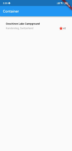
The second child in the column will be Text so they are displayed in the gray color. The last 2 items in the title section will be the star icon which is painted red, as well as the text which is set in “41”.
These are much more simple to analyze and ensure in providing you the great results to excellence. The complete entire row will be added to the Container so that they will be padded at the edge.
Single Child Widgets:
The Single Child Widgets would have only a single widget as the child so that every widget would have a special layout based on the function. Normally, these have a center widget with the child widget in its center based on the parent widget as well as the container widget. These would be extensively providing complete flexibility inside by using a varied option such as decoration, padding, and many more.
- Easy to create a quality widget with a single functionality – button, label, and many more
- Easy to create a simple button with the Container widget
Before talking about the Layout in Flutter, the core of the layout in the Flutter Application will be a widget. All the images, icons, labels as well as text will be technically the widget, so these vary with layouts and types. Common layout widgets are divided into two categories such as
- Standard Widgets
- Material Widgets
Standard Widgets:
These are basic widgets that are used in almost all apps in Flutter. These widgets in Flutter are listed as
- ListView
- GridView
- Container
- Stack
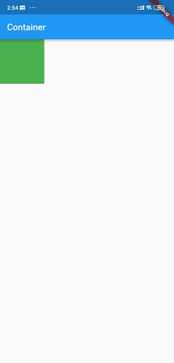
Container:
Generally, the container is a highly preferred widget in Flutter. It is quite a convenient option for adding the margin, padding, border, as well as background color in widgets. Flutter experts customize widgets also easily according to our requirements. These would also contain the child or a single widget. Remember Flutter optimization tips while working on Flutter development.
Example:
Scaffold(
	appBar: AppBar(
		title: Text(“Container”),
	),
	body: SafeArea(
			// Container implementation
			child: Container(
			height: 100.0,
			width: 100.0,
			color: Colors.green,
		),
	      ),
	);
Output:
Step 4: Adding The Button Row
The Layouts in Flutter have the button section, and these are equipped with three columns that use the same layout. It is called as the icon over a row of the text. It involves the column in rows that would be evenly spaced accordingly. Text and icons will be easily painted using primary color.
The code for building all the columns would be extensively identical. These are helpful for creating the private helper method and are called the buildButtonColumn(). It could be seen as the color, text, icon as well as returns.
Conclusion
Everything in Flutter UI is basically a widget. These are called structural elements such as text and buttons. Building Layouts in Flutter involves various elements such as rows and padding. It could be combined into more complex layouts in widgets.
Frequently Asked Questions (FAQs)
1. What is ViewGroup in android development?
A ViewGroup in the mobile application is the collection of views like TextView, EditText , ListView,etc. that are similar to the container. A view object is the element of an user interface (UI) such as button or text box, and it is known as a widget.
2. State crossAxisAlignment functionality in Flutter
The crossAxisAlignment feature will examine how rows and columns position their children on its cross axes. A cross axis of row is vertical, whereas the column is horizontal. It has the five possible values: CrossAxisAlignment. start.
3. How will a container widget work in a Flutter?
The container class inside Flutter is a convenience widget which merges painting, positioning and size of widgets. It is frequently used to store one or more widgets and position them on the screen as per the developer convenience. In short, it is a container like a box to store the content.