How to implement Card Component in React?
Reactstrap is a popular front-end library that has React Bootstrap 4 components. So, in this article, we will see how to implement the Card Component in React.
How to implement Card Component in React?
Reactstrap library contains the stateless React components for Bootstrap 4. The Card components allow the user to display content. We can use the following approach in ReactJS to use the ReactJS Reactstrap Card Component.
Card Props:
- tag: Card Props tag can be a function or a string, and it is used to denote the tag for this component.
- inverse: The inverse props in reactStrap are used to indicate whether to inverse text color or not.
- color: The color props are used to change the color of the card. It should be in RGB format and the name of the color.
- body: The body props are used to indicate whether to apply card-body class or not in the reactStrap component.
- className: The className props are used to denote the class name for styling the component in reactStrap.
CardBody Props:
- tag: The CardBody props can be a function or a string, and it is used to denote the tag for this component in reactStrap.
- className: The className props are used to denote the class name for this component in reactStrap.
CardColumns Props:
- tag: The tag CardColumns Props can be a function or a string, and it is used to denote the tag for this component.
- className: The className props are used to denote the class name for this component, which is used for styling the CSS.
Card deck Props:
- tag: The tag props come under the Card deck Props. On the card deck, it can be a function or a string, and it is also used to denote the tag for this component.
- className: The className props come under Card deck Props and are used to denote the class name for this component.
CardFooter Props:
- tag: The tag Props come under the CardFooter Props. It can be a function or a string, and it is used to denote the tag for this component.
- className: The className props come under the CardFooter Props. It is used to denote the class name for this component.
CardGroup Props:
- tag: The tag props in CardGroup can be a function or a string, and it is used to denote the tag for this component.
- className: className pops comes under the CardGroup Props .It is used to denote the class name for this component.
Creating React Application
1) Create a React application using the following command.
npx create-react-app foldername
2) After creating your project folder i.e. folder name, move to it using the following command.
cd foldername
3) Install Reactstrap in your given directory.
npm install --save reactstrap react react-dom
Now write down the following code in the App.js file. Here, the App is our default component where we have written our code.
import React from 'react'
import 'bootstrap/dist/css/bootstrap.min.css';
import {
    Card, CardImg, CardBody,
    CardTitle, CardText, Button
} from "reactstrap"

function App() {
    return (
        <div style={{
            display: 'block', width: 700, padding: 30
        }}>
            <h4>Reactstrap Card Component in ReactJS</h4>
            <Card>
                <CardImg
                    width="50px"
                    height="50px"
                src="Your image URL"
                    alt="BOSC Tech Labs"/>
                <CardBody>
                    <CardTitle tag="h5">Your Card title of Your Choice</CardTitle>
                    <CardText>Your Card Text you need to display!</CardText>
                    <Button>Action Button</Button>
                </CardBody>
            </Card>
        </div>
    );
}

export default App;
Run the application using the following command from the root directory of the project:
npm start
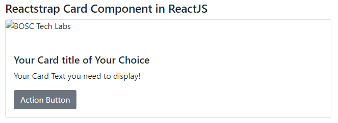
So, now open your browser and go to http://localhost:3000/, you will see the following output:
Conclusion:
So, in this article, we have been through how to implement the Card Component in React. Also, feel free to comment with your suggestions and feedback on the post. Moreover, at BOSC Tech Labs, we have a team of highly experienced React JS developers. They can assist you in developing your customized web app. So contact us to hire experienced ReactJS developers.
