
How to implement the Form component in ReactJS?
Reactstrap is a well-known front-end library used in ReactJS. So, in this article, we will see how to implement the Form component in ReactJS.
How to implement the Form component in ReactJS?
This library has the stateless React components for Bootstrap 4. You can use the Form component when you need to create an instance or collect information. Below we have listed props of the ReactJS Reactstrap Form Component which you can use in your code.
Input Props:
- children: You can use this prop to pass the children element to this component.
- type: You can use this prop to denote the type like radio, checkbox, select, etc.
- size: You can use this prop to denote the size of this component.
- bsSize: You can use this prop to denote the bs size like large, small, etc.
- state: You can use this prop to denote the state for this component.
- valid: You can use this prop to apply the is-valid class when this is set to true.
- invalid: You can use this prop to apply the is-invalid class when this is set to true.
- tag: You can use this prop to pass in custom elements to use.
- innerRef: You can use this prop to get a reference to the DOM element.
- static: You can use this prop to indicate whether the static class is applied or not.
- plaintext: You can use this prop to indicate whether the plaintext class is applied or not.
- addon: You can use this prop to indicate whether the add-on is added or not.
- className: You can use this prop to denote the class name for styling.
- cssModule: You can use this prop to denote the CSS module for styling.
CustomInput Props:
- children: You can use this prop to pass the children element to this component.
- id: You can use this prop to denote the id attribute for the unique identification.
- type: You can use this prop to denote the type like radio, checkbox, select, etc.
- label: You can use this prop for checkboxes and radios.
- inline: You can use this prop to apply the inline class when this is set to true.
- valid: You can use this prop to apply the is-valid class when this is set to true.
- invalid: You can use this prop to apply the is-invalid class when this is set to true.
- bsSize: You can use this prop to denote the bs size like large, small, etc.
- cssModule: You can use this prop to denote the CSS module for styling.
- children: You can use this prop to pass the children element to this component.
- innerRef: You can use this prop to get a reference to the DOM element.
Form Props:
- children: You can use this prop to pass the children element to this component.
- inline: You can use this prop to apply the inline class when this is set to true.
- tag: You can use this prop to pass in custom elements to use.
- innerRef: You can use this prop to get a reference to the DOM element.
- className: You can use this prop to denote the class name for styling.
- cssModule: You can use this prop to denote the CSS module for styling.
FormFeedback Props:
- children: You can use this prop to pass the children element to this component.
- tag: You can use this prop to pass in custom elements to use.
- className: You can use this prop to denote the class name for styling.
- cssModule: You can use this prop to denote the CSS module for styling.
- valid: You can use this prop to apply the is-valid class when this is set to true.
- tooltip: You can use this prop to show the tooltip but the condition is that the parent element must contain the relative position style.
FormGroup Props:
- children: You can use this prop to pass the children element to this component.
- row: You can use this prop to apply the row class when this is set to true.
- check: You can use this prop to apply the form-check class when this is set to true.
- inline: You can use this prop to apply the inline class when this is set to true.
- disabled: Applied the disabled class when the check and disabled props are true, does nothing when false.
- tag: You can use this prop to pass in custom elements to use.
- className: You can use this prop to denote the class name for styling.
- cssModule: You can use this prop to denote the CSS module for styling.
FormText Props:
- children: You can use this prop to pass the children element to this component.
- inline: You can use this prop to apply the inline class when this is set to true.
- tag: You can use this prop to pass in custom elements to use.
- color: You can use this prop to denote the color for this component.
- className: You can use this prop to denote the class name for styling.
- cssModule: You can use this prop to denote the CSS module for styling.
Creating React Application
1) Create a React application using the following command:
npx create-react-app foldername
2) After creating your project folder i.e. foldername, move to it using the following command:
cd foldername
3) After creating the ReactJS application, Install the required module using the following command:
npm install reactstrap bootstrap
Example:
Write down the code. Moreover, we have shown the Form Component with the help of the Col component and row prop.
import React from 'react'
import 'bootstrap/dist/css/bootstrap.min.css';
import {

    FormGroup, Label, Input,
    Button, Form, Col
} from 'reactstrap';

function App() {

    return (
        <div style={{
            display: 'block', width: 950, padding: 30
        }}>
            <h5>ReactJS Reactstrap Form Component</h5>
            <Form inline>
                <FormGroup row className="mb-2 mr-sm-2 mb-sm-0">
                    <Col sm={4}>
                        <Label for="emailField">EMAIL:</Label>
                        <Input type="email" name="email" id="emailField"
                            placeholder="Enter your email" />
                    </Col>
                    <Col sm={4}>
                        <Label for="passwordField">PASSWORD:</Label>
                        <Input type="password" name="password"
                            id="passwordField"
                            placeholder="Enter your password" />
                    </Col>
                </FormGroup>
                <Button>Submit</Button>
            </Form>
        </div >
    );
}

export default App;
Run the application using the following command from the root directory of the project:
npm start
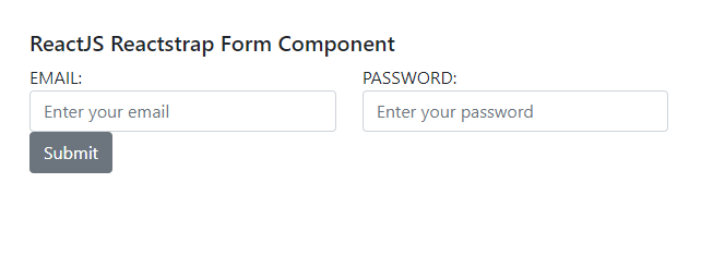
Output:
Conclusion:
So, in this article, we have been through how to implement the Form component in ReactJS. Also, feel free to comment with your suggestions and feedback on the post. Moreover, at BOSC Tech Labs, we have a team of highly experienced React JS developers. They can assist you in developing your customized web app. So contact us to hire experienced ReactJS developers.