
How to implement the Tabs component in React?
BlueprintJS is a React-based UI toolkit for the web. So, in this article, we will see how to implement the Tabs component in React.
How to implement the Tabs component in React?
This library is very optimized and popular for building interfaces. These interfaces are complex data-dense for desktop applications. So, the tabs Component allows the user to switch between components present in given different tabs. Also, below are the properties of the Blueprint Tabs Component in React.
Tabs Props:
- animate: You can use this prop to indicate whether the selected tab indicator should animate its movement or not.
- className: You can use this prop to denote a space-delimited list of class names to pass along to a child element.
- defaultSelectedTabId: You can use this prop to denote the initially selected tab ID, for uncontrolled usage.
- id: You can use this prop to denote the Unique identifier for this Tabs container.
- large: When this is set to true the tab titles will display with larger styling.
- onChange: It is a callback function. It will trigger when you will click a tab in the tab list.
- renderActiveTabPanelOnly: You can use this prop to indicate whether inactive tab panels should be removed from the DOM and unmounted in React or not.
- selectedTabId: You can use this prop to denote the selected tab ID, for controlled usage.
- vertical: You can use this prop to indicate whether to show tabs stacked vertically on the left side or not.
Tab Props:
- children: You can use this prop to pass the child component to the underlying element.
- className: You can use this prop to denote a space-delimited list of class names to pass along to a child element.
- disabled: You can use this prop to indicate whether the tab is disabled or not.
- id: You can use this prop to denote the Unique identifier for this Tab container.
- panel: You can use this prop to denote the panel content, rendered by the parent Tabs when this tab is active.
- panelClassName: You can use this prop to denote a space-delimited string of class names applied to the tab panel container.
- title: You can use this prop to denote the content of the tab title element.
Creating React Application:
1) So, create a React application using the following command:
npx create-react-app foldername
2) After creating your project folder i.e. foldername, move to it using the following command:
cd foldername
3) After creating the ReactJS application, Install the required module using the following command:
npm install @blueprintjs/core
Example:
import React from 'react'
import '@blueprintjs/core/lib/css/blueprint.css';
import { Tabs, Tab } from "@blueprintjs/core";
function App() {
return(
<divstyle={{
display: 'block', width: 400, padding: 30
}}>
<h3>Blueprint Tabs Component in ReactJs</h3>
<Tabs
animate={true}
key={"vertical"}
vertical={false}
>
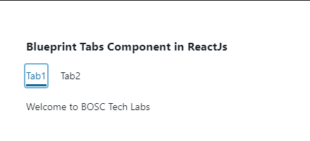
<Tab id="rx" title="Tab1" panel={
<p>Welcome to BOSC Tech Labs</p>
} />
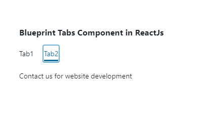
<Tab id="ng" title="Tab2" panel={
<p>Contact us for website development</p>
} />
</Tabs>
</div >
);
}
export default App;
Run the application using the following command from the root directory of the project:
npm start
Output:
Conclusion:
So, in this article, we have been through how to implement the Tabs component in React. Also, feel free to comment with your suggestions and feedback on the post. Moreover, at BOSC Tech Labs, we have a team of highly experienced React JS developers. They can assist you in developing your customized web app. So contact us to hire experienced ReactJS developers.