Obtaining user details that require a substantial amount of data from users can become necessary while developing and designing a mobile application. Users should showcase Multiline TextField to access that massive amount of information. Further, this article is about developing a multiline text field widget in Flutter.
A TextField widget can only display one line by default. However, TextField needs to be extendable. For instance, the users have to input enormous amounts of Text.
The TextField’s maxLines attribute allows you to add several lines. Finally, specify how many lines you need for that particular TextField. For example, several programming businesses take the help of professional developers to design the multiline text field in Flutter.
About TextField Widget
Among the most essential and popular widgets in Flutter is TextField. In numerous circumstances, it is helpful to take user input. Utilizing it in a messaging platform to enable users to send messages is a perfect example. However, there are situations when users might have to input a lengthy message while also wishing to view the entire Text.
You may include the multiline TextField. Multiline TextFields are input fields that accept Text across multiple lines. These fields are helpful in situations where it is necessary to collect customer insights, user comments, and descriptions, among other things. By adjusting the TextField’s keyBoardType and maxLines properties, we may create multiline TextFields.
About the issue
After adding it to the Flutter application development, you’ll discover that as you type a long message that doesn’t suit a single line in the TextField widget. The old Text of the initial Text begins to migrate toward this left side. Users might be agitated by this, which could ruin their experiences.
Methods to create Multiline Textfield in Flutter
The expands, maxLines, and minLines properties help construct the multiline TextField in Flutter. Each of these methods is useful, depending on the circumstances.
1. Utilizing minLines and maxLines Properties
The TextField can create multiline using the minLines and maxLines, and minLines settings. The TextField height is presented initially according to the supplied minLines. After which, it rises until it exceeds the line indicated by the maxLines parameter. At this point, it displays the scrollbar just after the Text exceeds maxLines.
Stages
Stage I: Add the minLines variable within the TextField and assign it to 1.
Stage II: MaxLines, a new function, should be added and configured to 5. It will guarantee that TextField displays a complete message up until the fifth line.
Stage III: Launch the application.
Here is the coding:
TextField(
decoration: InputDecoration(labelText: 'Enter Message'),
keyboardType: TextInputType.multiline,
minLines: 1, // <-- SEE HERE
maxLines: 5, // <-- SEE HERE
)
2. Using Just maxLines parameter
You may occasionally permit TextField heights to increase as much as its parent permits. The maxLines parameter helps do this.
Stages
Stage I: Add the maxLines variable within the TextField and configure it to zero.
Stage II: Launch the application.
Here is the coding:
TextField(
decoration: InputDecoration(labelText: 'Enter Message'),
keyboardType: TextInputType.multiline,
maxLines: null, // <-- SEE HERE
)
3. Using expands Property
You should also enclose your TextField widget within the Expanded widget. However, with Flutter expertise, you’ll discover that the TextField underlining also appears beneath the first line. So, it expands the attribute to display the underlining on the final line.
Stages
Stage I: Add the maxLines variable to TextField and configure it to zero.
Stage II: Modify the expand parameter to true after adding it.
Stage III: Launch the function.
Here is the coding:
Container(
             height: 300,
             child: Column(
               children: [
                 SizedBox(
                   height: 10,
                 ),
                 Expanded(
                   child: TextField(
                     decoration: InputDecoration(labelText: 'Enter Message'),
                     keyboardType: TextInputType.multiline,
                     maxLines: null,
                     expands: true, // <-- SEE HERE
                   ),
                 ),
                 ElevatedButton(
                   onPressed: () {},
                   child: const Text(
                     'Send',
                     style: TextStyle(fontSize: 24),
                   ),
                 ),
               ],
             ),
            ),
Another method
Stage 1: Open Android Studio and start a new project
Navigate to Android Studio Configuration for Flutter Programming for instructions on configuring Flutter Development on Android Studio. Afterward, start a new project in Android Studio by following the instructions in Creating a Simple App in Flutter.
Stage 2: integrate the material bundle
By including the material module, which provides us with the necessary functionalities, we can execute the runApp feature for the primary purpose, which will then launch the program. Below is the code:
import 'package:flutter/material.dart';
void main() {

runApp(RunMyApp());
}
Stage 3: Stateless Widget generation
Since the application cannot modify its state, we must now create a stateless widget and afterward provide the materialApp widgets, enabling us to set the headline, background, and numerous other options. Below is the coding:
class RunMyApp extends StatelessWidget {
    const RunMyApp({super.key});

    @override
    Widget build(BuildContext context) {
        return MaterialApp();
    }
}
Step 4: Building Scaffold Widget
Specify the homepage parameter, and a scaffold widget with the AppBar and body properties can appear. AppBar allows us to specify the title, color, leading logo, and trailing logo. The TextField with values maxLines, keyboardType, and minLines is within the body. Below is the coding:
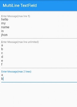
home: Scaffold(
        appBar: AppBar(
          title:const Text('MultiLine TextField'),
        ),
        body: Padding(
          padding: const EdgeInsets.all(8.0),
          child: Column(
            crossAxisAlignment: CrossAxisAlignment.start,
            children: const [
              TextField(
                decoration:
                    InputDecoration(labelText: 'Enter Message(max line 5)'),
                keyboardType: TextInputType.multiline,
                minLines: 1, // <-- SEE HERE
                maxLines: 5, // <-- SEE HERE
              ),
              TextField(
                decoration: InputDecoration(
                    labelText: 'Enter Message(max line unlimited)'),
                keyboardType: TextInputType.multiline,
                maxLines: null, // <-- SEE HERE
              ),
              TextField(
                decoration: InputDecoration(labelText: 'Enter Message(max 2 lines)'),
                keyboardType: TextInputType.multiline,
                maxLines: 2,
              ),
            ],
          ),
        ),
      ),
Output
Conclusion
This article covered the multiple methods for building multi-line TextFields in Flutter. Hire Flutter experts from the well-reputed app development company who initially look at the issue of employing a single-line TextField before looking at every method for making TextField multi-line. Fundamentally, the properties of the expand, maxLines, and minLines are combined to form the Multiple lines TextField. It upgrades your programming area and app development process.
To create a multi-line textfield input like a textarea in Flutter, use the TextField widget with maxLines set to null. At Bosc Tech Labs, a generative AI development company, we specialize in creating such advanced Flutter features.
Suppose you want to develop a Flutter app for your enterprise. In that case, you can consult the best mobile app development company, like Bosc Tech Labs, who will assist you with your project and also take care of an app that must fit perfectly into your budget.

Frequently Asked Questions (FAQs)
1. How do I make the multi-line textarea?
To develop the multi-line text input, use the HTML tag. With that, set the size of the textarea by using cols and rows attributes. It is also used inside the form to allow users to input the text over multiple rows. Hence, it specifies the page load text area, which automatically gets the focus.
2. Can the value be added to the textarea?
To add value to textarea, you can add to the value property of input through the document.getElementById. Hence, get the reference of this element and modify the value.
3. What does multi-line text permit you to do?
The Multi-line text field is utilized to save a considerable amount of text. It gives various formatting options, like adding bulleted and numbered lists. Use italics, bold, and underlined styling.
Book your appointment now