MUI was initially developed as a Material Design implementation just for React apps.
To develop a user interface in our React applications, we can simply import and use several components from the Material-UI package. As a result, the developers can save a lot of time by not having to write everything from start.
You can use it with MUI, formerly known as Material-UI, to create applications and websites. Initially, MUI was a version of Material Design made just for React applications.
A new design framework that will compete with Material Design is being developed by the brand as it grows today.
How to include MUI into a React app
To use the Material-various UI’s features or components, we must first install it. Make sure you are in the master folder for your application when you open your terminal.
npmi @mui/material
You can use both typeface icons and SVG icons with Material-UI. Add the following code to your public/index.html file’s <head> tag to use font icons.
Run the command and install @material-ui/icons as a dependency to use SVG icons.
npm install @material-ui/icons
Example:
Import React from “react”;
import Button from '@mui/material/Button';
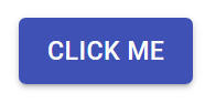
function App() {
return<Buttoncolor="primary" variant="contained">Hello World</Button>;
}
OutPut:
Import React
Example2:
import React, { useState } from 'react';
import Button from '@mui/material/Button';
import { makeStyles } from '@mui/styles';
import Box from '@mui/material/Box';
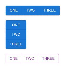
We can create our own component to group various buttons. But to make things simpler for us, Material-UI offers a different component named ButtonGroup. This component can be used to group buttons that are related.
Example:
const buttons = [
,
,
,
];
return (
{buttons}
{buttons}
</div > )
}
OutPut:
medium secondary button group
Conclusion:
It’s simple to include Material Design into the output of your React application by using the Material-UI component library. You have learnt how to set up and use Material-UI in your React project in this tutorial, as well as how to build a sample application for a real-world setting from scratch.
At Bosc Tech Labs you can hire an experienced React Developer team who will provide you high-end and outstanding applications for your business. If you have any query, feel free to contact us.
Request a Quote
Lets have dialogue
if you have an idea and want to make it happen or to just know about how we work.
We use cookies on our website to give you the most relevant experience by remembering your preferences and repeat visits. By clicking “Accept All”, you consent to the use of ALL the cookies. However, you may visit "Cookie Settings" to provide a controlled consent.
This website uses cookies to improve your experience while you navigate through the website. Out of these, the cookies that are categorized as necessary are stored on your browser as they are essential for the working of basic functionalities of the website. We also use third-party cookies that help us analyze and understand how you use this website. These cookies will be stored in your browser only with your consent. You also have the option to opt-out of these cookies. But opting out of some of these cookies may affect your browsing experience.
Necessary cookies are absolutely essential for the website to function properly. These cookies ensure basic functionalities and security features of the website, anonymously.
Cookie
Duration
Description
cookielawinfo-checkbox-analytics
11 months
This cookie is set by GDPR Cookie Consent plugin. The cookie is used to store the user consent for the cookies in the category "Analytics".
cookielawinfo-checkbox-functional
11 months
The cookie is set by GDPR cookie consent to record the user consent for the cookies in the category "Functional".
cookielawinfo-checkbox-necessary
11 months
This cookie is set by GDPR Cookie Consent plugin. The cookies is used to store the user consent for the cookies in the category "Necessary".
cookielawinfo-checkbox-others
11 months
This cookie is set by GDPR Cookie Consent plugin. The cookie is used to store the user consent for the cookies in the category "Other.
cookielawinfo-checkbox-performance
11 months
This cookie is set by GDPR Cookie Consent plugin. The cookie is used to store the user consent for the cookies in the category "Performance".
viewed_cookie_policy
11 months
The cookie is set by the GDPR Cookie Consent plugin and is used to store whether or not user has consented to the use of cookies. It does not store any personal data.
Functional cookies help to perform certain functionalities like sharing the content of the website on social media platforms, collect feedbacks, and other third-party features.
Performance cookies are used to understand and analyze the key performance indexes of the website which helps in delivering a better user experience for the visitors.
Analytical cookies are used to understand how visitors interact with the website. These cookies help provide information on metrics the number of visitors, bounce rate, traffic source, etc.
Advertisement cookies are used to provide visitors with relevant ads and marketing campaigns. These cookies track visitors across websites and collect information to provide customized ads.